Queen Bee Cosmetics
Project Objective
Logo & Packaging Design
Programs Used
Illustrator & Photoshop
Description
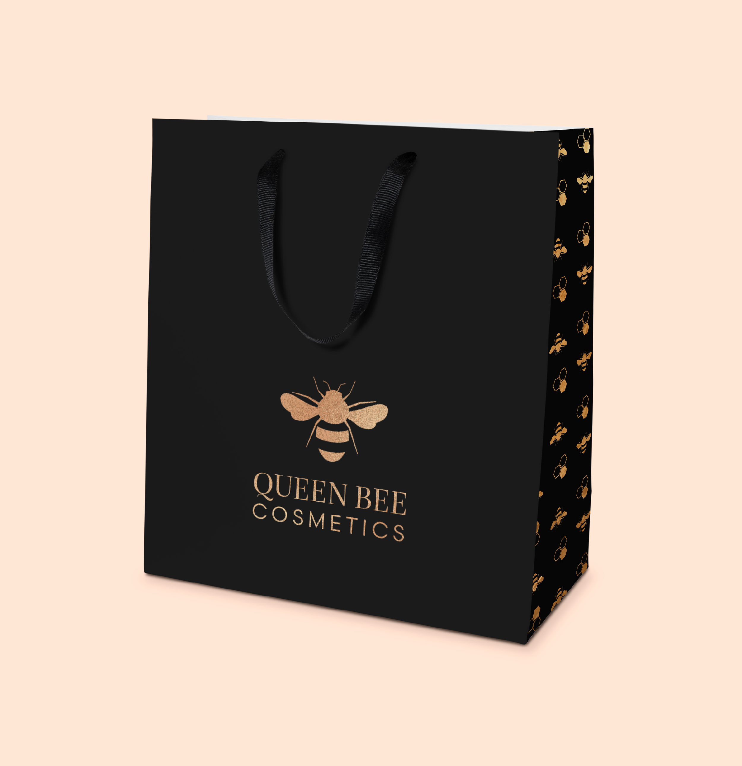
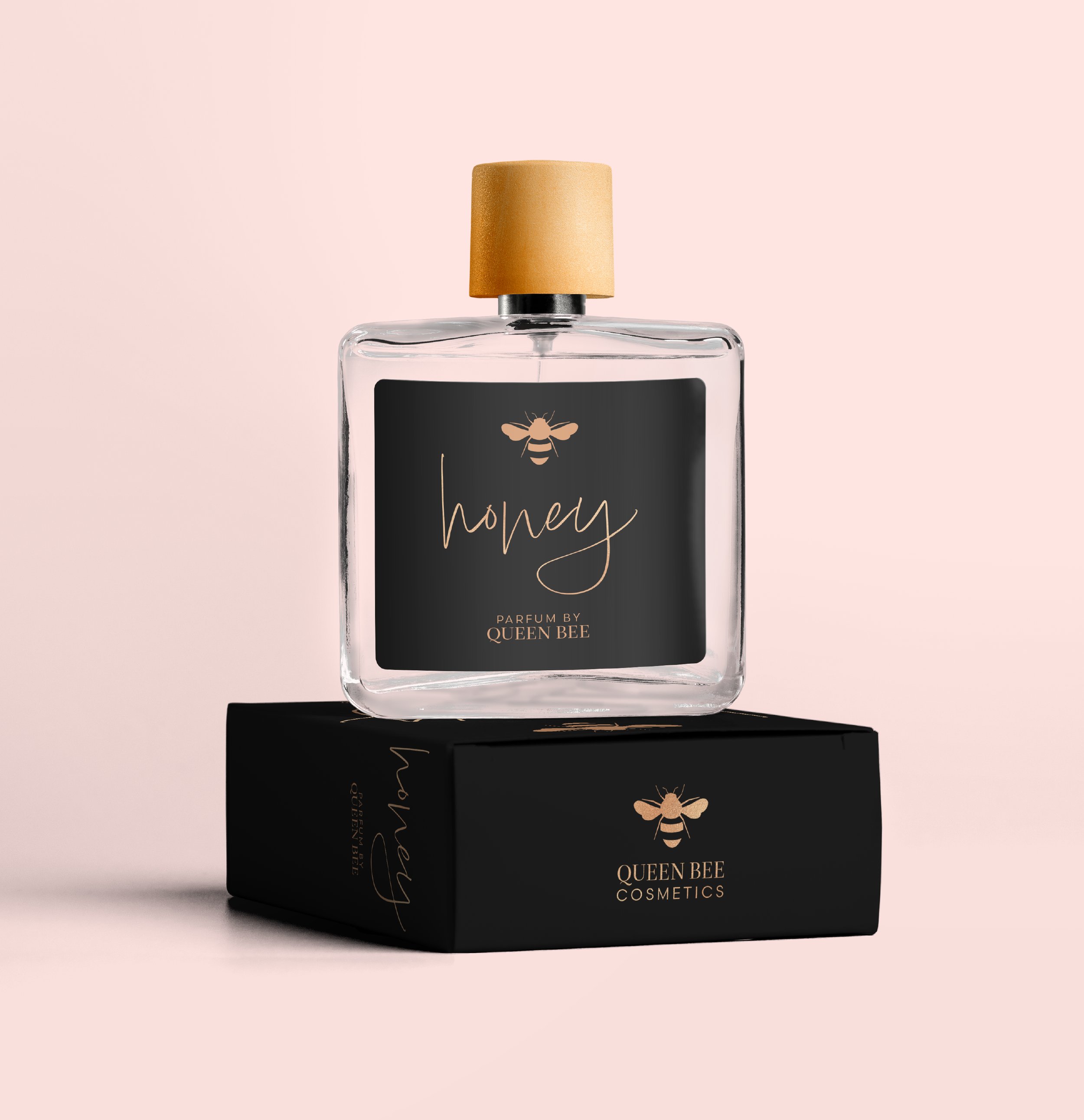
Queen Bee started as an illustration project but quickly evolved into a logo and packaging project for a luxury cosmetics brand. I selected the logo typefaces and colors for their modern, elegant characteristics and incorporated gold foil effects to emphasize the brand’s premium quality and sophisticated appeal. The packaging was designed be elegant but minimalistic with lots of white space.


Process
This project started with a hand-drawn illustration that I gradually simplified into a refined logo design. Earlier designs using more pointed shapes gave the logo a more aggressive feel. The final design used rounded shapes to create a friendly feel to the Queen Bee logo.


Typefaces were selected for their refined appearance to complement the logo and give the text a polished appearance. The primary colors were based on the stripes of honey bees and the secondary color was selected to provide balance and interest to the design.


